Team members
- Tess Roode (ID: 221052)
- Nina Straga (ID: 221424)
- Demi Middelkoop (ID: 223762)
- Karla Šantić (ID: 221443)
Production
Design Elements
Colour Palette
-
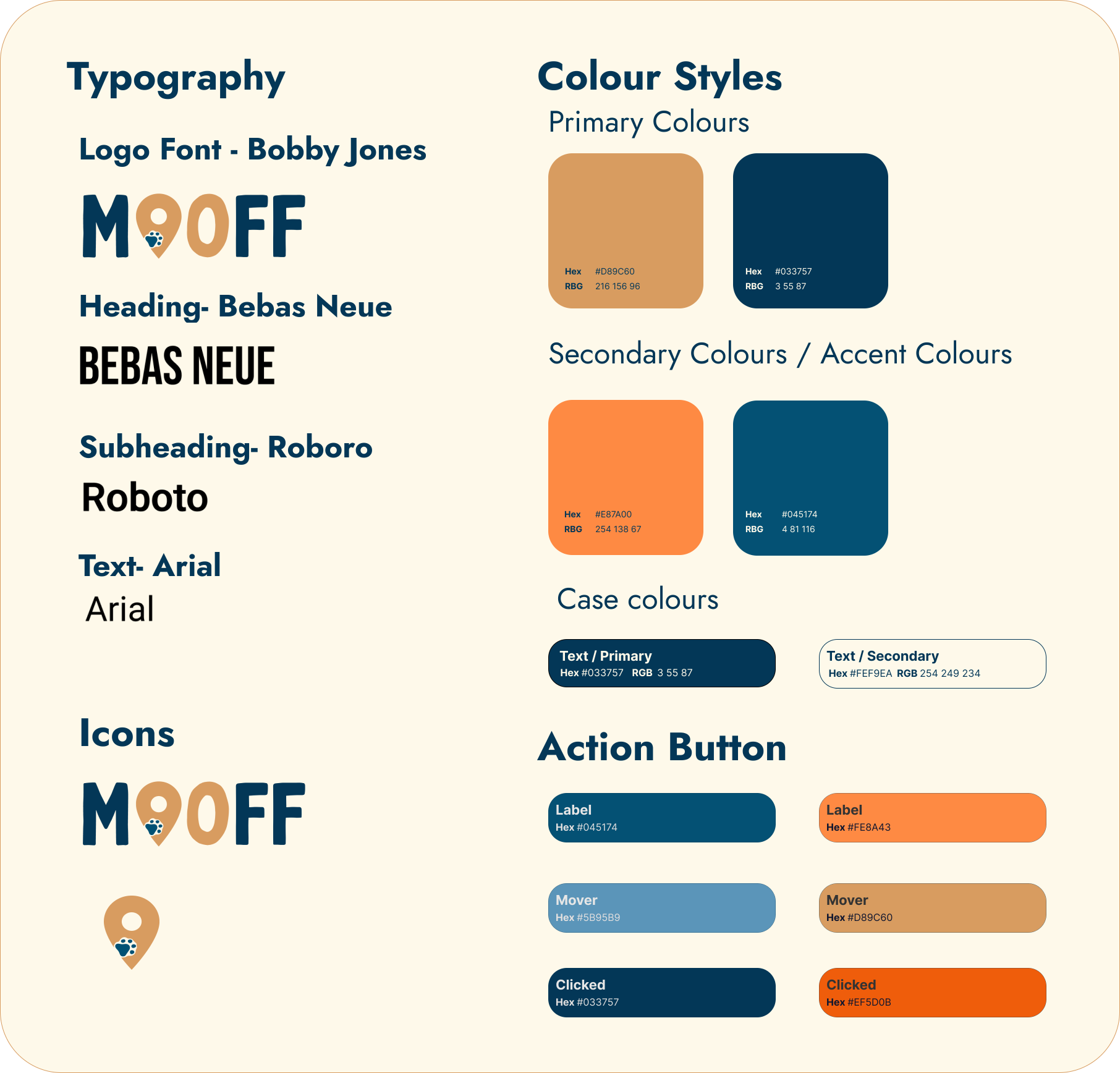
- #D89C60 The brownish orange colour represent the connection to nature and animals. Mooff strives to feel like your everyday go to platform when going on a walk. We hope that this colour envoces that to our users
- #033757 Dark blue signifies the stability and safety that Mooff provides to their users
- #E87A00 The orange colour refers to the Dutch identity and the city of Breda. Mooff is primarly launching in Breda, Netherlands and want to conncect to the identity of this region. However, this colour is not used as a primary colour but more as an accent to already exisiting elements.
- #045174 While this is still a dark blue, it is a lighter shade than our logo colour. This accent colour furthermore signifies the stability and empowerment Mooff wants their users to feel.
- #FEF9EA The background colour of the Mooff is a cream beige that creates a cohesive look. Along with the rest of the colour palette, this background blends easily and creates a minimalist and modern look.
- Header font: Bobby Jones
- Unfortunately, this font is not available on the website. However, Mooff fell in love with it when creating the logo. Therefore this font is still visible on our landing page and the top left corner of each page. This fonts represents the stregnth and firmness that the brand has to pursue its mission while still having the softer lines to represent the friendly tone to its users.
- Text font: Bebas Neue
- The text font is the font that Mooff uses to write on the website. This font is used to create a modern and minimalistic look. The font has a similar look to Bobby Jones, however it does have a rougher edge. The font is used as a heading font (18pt) and subheading font (14pt)
- Text font: Roboto
- The text font is used as the higlighting font. It creates a gentle balance between the harsher header font and softer Arial font that is used as a body font. Roboto provides and easy higlighted overview over more importnat but not key information.
- Text font: Arial
- The text font is used as the body font. It creates a modern and minimalistic look, providing the user with a break from the bold fonts used in the rest of the website.
- The website was created with a simple wireframe in mind. Mooff wants their user to take the least possible steps to achive their goals, either accesing the map or buying the products
- This is why the landing page contains the continuos scroll to access all of the elements of the Mooff brand. The users have the brand introduction and personality from one glance at the page and from travelling further down, they can acces the Map, adn further more a product carousel, giving an even clearer overview of the brand products
- The elements in the page were created to showcase a minimalistic and modern look that creates a friendly environment to the users. However, the webiste elements show the structure and stability that the brand wants to convey. The rounded corners, blended images, and animations create a welcoming athmospfere for anyone willing to join the Let's Mooff movement
Font choices
User interface elements
Credits
- this website was derived solely from the course provided template (buas-media-interactive/prj4-group-template)
- All images and icons were created by the team, in the Canva Suite
Testing Report
The participants are given a task to go through the website and enter the product page. Besides that, the test participants will be given the website without prior knowledge of what the website is for, and after doing the testing, they will be asked to explain what the brand is about.
The participants consist of dog owners who live in the Breda city centre, within the age of 16 and 30 years old. They will be asked to voice their thoughts out loud in order for us to assess what their thought process is, hopefully reaching new findings or issues we did not think of.
Findings
First testing round (Figma Demo)
The Figma prototype consisted of basic design layout and functionality, with minimal (brand vision) explanations and copyright text. The users were clear on the fact that the brand is for animals, once they read further, they were clear on the fact that is for dogs. The websites primary product was a map but due to the layout of the page, users were confused with the priority on the harness.
Second testing round (website)
The users were given a task to look through the landing page and access the product website. Once they opened the website, the users were met with a landing animation displaying the logo and they were clear on the animal motives and that the brand involves animals (dogs).
Once they scrolled through, they were met with the download the map segment. Two of the users wondered if the map is only meant for dog walks. It was unclear to them the actual functionalities of the map. While two of the others have not commented on the possible usage but were satisfied with the provided product explanation.
The main task was to find the product page and access which they all successfully found. Some of them accessed it through the carousel feature clicking on their desired harness colour but struggled to go back to the assortment product page. They had to take a few extra moments to locate the products page in the navigation bar.
The male tester and the 26-year-old women tester went through the navigation bar to access the product page where they were met with an overall product explanation before choosing a specific product.
All of the users tried adding the item to cart due to the button being present, however hat functionality is still not possible on the presentable website.
Suggestions
While the Mooff team would like to say that the testing was succesful, there were quite a few suggestions from our users spanning over the demo and website testing.
From the demo testing, Mooff changed the overall look and layout of the website. We wanted to pivot our focus to the Mooff map so we moved it above the product carousel.
Furthermore, the landing page was made more interactive, with an animation, to convey the sense of modernism
From the website testing, Mooff is deciding to further develop the product pages. The functionalities of the 'Add to cart' button weren't up to date while conducting the testing and the Mooff team is still working on figuring out the best way to conduct this development.
Conclusion
The Mooff team agrees that developing the website is a long and meticulous process that might take us more time to perfect. However, at the moment we are content with how much was created on this website and once again thank all of our users for their time.